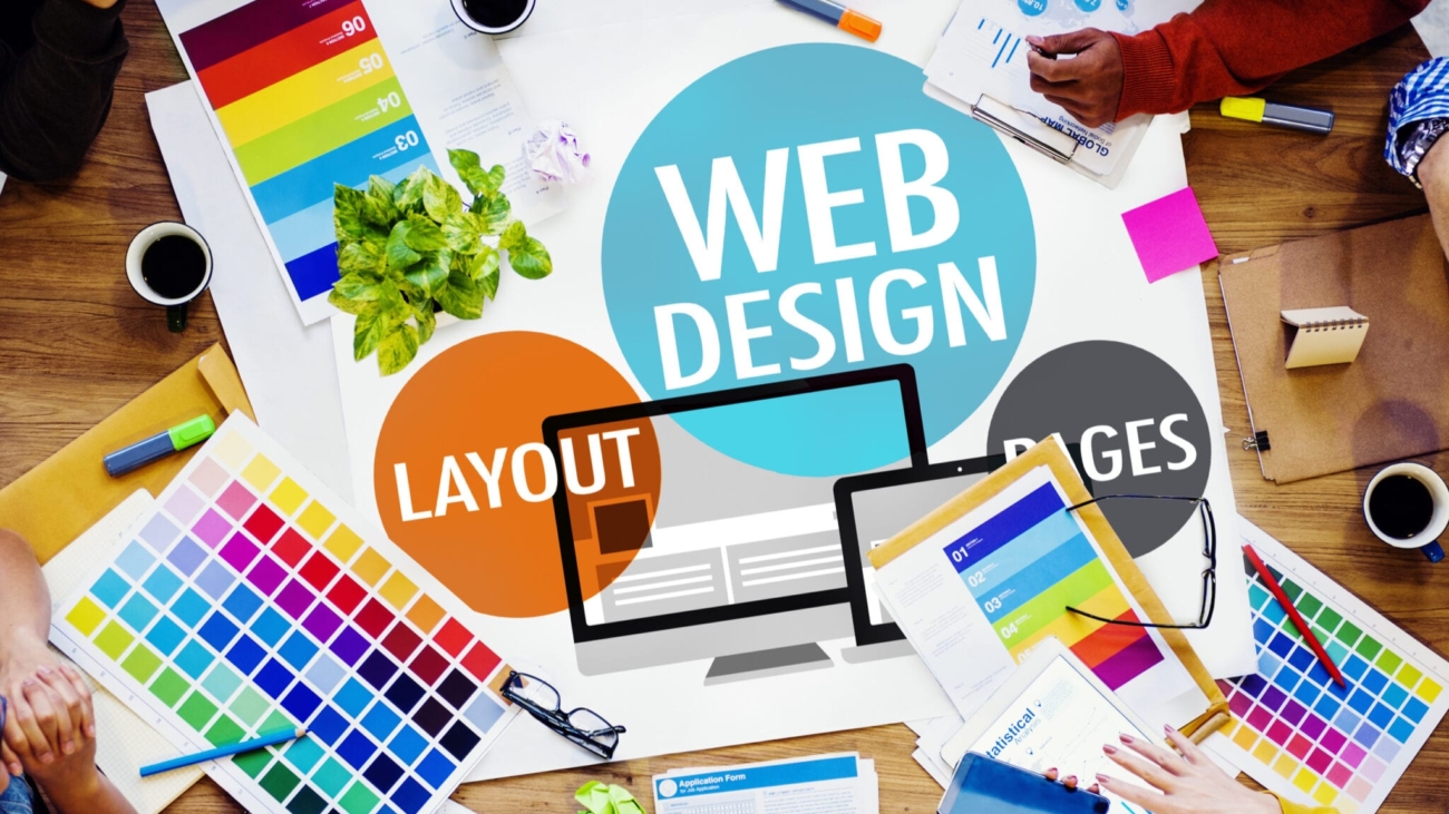
Since the dawn of visual graphics and design concepts, colour has been an irreplaceable element.
It continues to be a dominant force that can spell the difference between a visually-stunning website and a so-so lacklustre online page.
One thing’s clear, colour is a primary focal design element that has the power to communicate with your audience.
What does this mean for a real estate website?
It’s a fact- a real estate website needs to take advantage of the power of colour to get ahead in the market.
After all, people looking at property images online are attracted to vibrant and high-quality images with sharp colours that highlight the best parts of any property.
The name of the game nowadays is visual impact and this is achieved by using strong contrasts of vibrant and colours that stand out.
Traditional white backgrounds are out and big masses of colour have taken over, and palettes are no longer limited to a single dominant tone.
Neutrals modulating vibrant colours
The design world is witnessing a transition into the use of strikingly risky pairing and colours as it veers away from soft pastels- with focus drawn towards making an impact rather than evoking harmony.
Visual designs are making use of multiple ranges of vivid colours with differing non-adjacent hues and tones.
Generally, these vivid colour combinations are toned down with neutral or muted colours, to help draw the viewer’s attention to where designers want it to be.
To achieve this, one method is to use big solid areas of colour along and in some cases, isolated notes of luminous colours to catch attention.
Broad solid-coloured and colour-blocking areas
Since the 1960s, colour-blocking has been a common fashion design practice that consists of a blend of bright bold colours and complementary hues.
It may not be exactly opposite ends of the colour wheel, rather make use of contrasting colours to create interesting and eye-catching combinations.
Add colours to your existing palette
Colours have always been associated with branding, which has since been using two or three principal colours.
However, a recurring trend is emerging where more colour palettes are t highlighted by a principal colour and combined with several neutrals.
A good example is twitch rebranding, using a custom typeface and expanded colour palette consisting of numerous vivid shades. The palette- dominated by acid purple, blends into a set of neutrals to create duotone gradients that create a three-dimensional extrusion of the graphic elements in the design.
Colour-changing backgrounds
Chromatic sequencing of page backgrounds that transition into different colours as each page is scrolled is also a functional trend in visual design. Property images can be situated at the centre of the page with background colours providing a strong contrast to the focal image.
It helps accentuate the visual content through the use of strong contrast in background colours.
Typography for contrast
Typography becomes a graphic element with colour as its primary counterpoint, which can also be totally independent of how it can communicate as text content.
Text and backgrounds can play around with alternating complementary and high contrast colours which can be beautifully presented in animation sequences.
Taking advantage of these emerging and powerful design trends can help give your real estate website redesign a major boost and give it the performance traction it deserves.

